Visual Components
With the introduction of the UI system, new Components have been added that will help you create GUI specific functionality. This section will cover the basics of the new Components that can be created.
有新的组件和游戏对象已添加到 uGUI,允许和容易的创建 GUI 特定功能。这一节将介 绍新的游戏物体被创建的基础。
Text
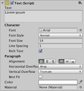
The Text component, which is also known as a Label, has a Text area for entering the text that will be displayed. It is possible to set the font, font style, font size and whether or not the text has rich text capability.
该 Text 组件,也被称为是一个标签,有一个 Text 区域用于输入将显示的文本。它是可 以设置的字体、 字体样式、 字体大小和是否使用 Rich Text 的能力。
There are options to set the alignment of the text, settings for horizontal and vertical overflow which control what happens if the text is larger than the width or height of the rectangle, and a Best Fit option that makes the text resize to fit the available space.
文本的对齐方式 alignment 和自动换行 Wrap 模式等选项设置。自动换行模式指定如果 太大,无法容纳标签的文本时将会发生什么。自动换行选项意味着文本将换行到下一行上, 但是必须是有空间显示,否则任何超出矩形的文本将被清除不予显示了,还有 Overflow 溢 出不换行的,一行放不下在举行外面显示。垂直上有 truncate 截断 。ResizeBounds 选项, 使适合文本的大小,自动、 动态的标签。最后的 Best 选项缩放文本大小以适合的标签高宽, 然后它像被包装一样。 文本效果目前是有限的,但包含在文本的周围创建一种指定颜色的阴影的影子, direction/distance 也可以被定义。
Image
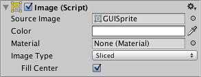
An Image has a Rect Transform component and an Image component. A sprite can be applied to the Image component under the Target Graphic field, and its colour can be set in the Color field. A material can also be applied to the Image component. The Image Type field defines how the applied sprite will appear, the options are:
切换到一个有 Rect Transform 组件和 Image 组件的对象上。一个精灵 sprite 可以应用于 Image 组件下 Source Image 字段,Color 字段中设置主颜色。一种材料还可以用于 Image 组 件。图像类型字段定义了如何显示应用的精灵,选项有:
- Simple - Scales the whole sprite equally.
- Simple - 同样大小显示整个雪碧。
- Sliced - Utilises the 3x3 sprite division so that resizing does not distort corners and only the center part is stretched.
- Sliced 切割 - 利用 3 x 3 精灵分割,以便调整不变形的角落的大小
- Tiled - Similar to Sliced, but tiles (repeats) the center part rather than stretching it. For sprites with no borders at all, the entire sprite is tiled.
- Tiled 平铺 - 重复的精灵游戏物体的边界内。
- Filled - Shows the sprite in the same way as Simple does except that it fills in the sprite from an origin in a defined direction, method and amount.
- Filled 填充 - 显示精灵和简单 Simple 的方式相同,它除了定义从原点开始填补的方向、 方法和数量。
The option to Set Native Size, which is shown when Simple or Filled is selected, resets the image to the original sprite size.
Set Native Size 这个选项(不用吧)要设置图像的原始大小为原始的精灵 size.c 值
Images can be imported as UI sprites by selecting Sprite( 2D / UI) from the ‘Texture Type’ settings. Sprites have extra import settings compared to the old GUI sprites, the biggest difference is the addition of the sprite editor. The sprite editor provides the option of 9-slicing the image, this splits the image into 9 areas so that if the sprite is resized the corners are not stretched or distorted.
Images 可以作为 uGUI 精灵导入,通过从 Texture Type 选择设置 Sprite (2D / uGUI)。 与 旧的 GUI 精灵相比 Sprites 有了扩展,最大的区别是增加了 sprite editor。sprite editor 为图 像提供的 9 切片选项,这将图像分成 9 个地区所以,为了是调整精灵大小时角落不拉伸或 扭曲。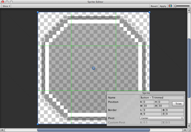
Raw Image
The Image component takes a sprite but Raw Image takes a texture (no borders etc). Raw Image should only be used if necessary otherwise Image will be suitable in the majority of cases.
Image 组件需要一个精灵,但 Raw Image 需要的是纹理 (无边界等)。使用 Raw Image 是 有必要,除非为图像会在大多数情况下适用。
Mask
A Mask is not a visible UI control but rather a way to modify the appearance of a control’s child elements. The mask restricts (ie, “masks”) the child elements to the shape of the parent. So, if the child is larger than the parent then only the part of the child that fits within the parent will be visible.
掩码是不可见的 UI 控件,是在修改控件的子元素的外观。掩码限制子元素的形状在父 对象内。所以,如果孩子是大于父,然后只有在父内的部分将可见。
Effects
Visual components can also have various simple effects applied, such as a simple drop shadow or outline. See the Effects reference page for more information.