Toggle
The Toggle control is a checkbox that allows the user to switch an option on or off.
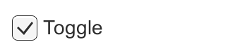
A Toggle.
Properties
| Property: | Function: |
|---|---|
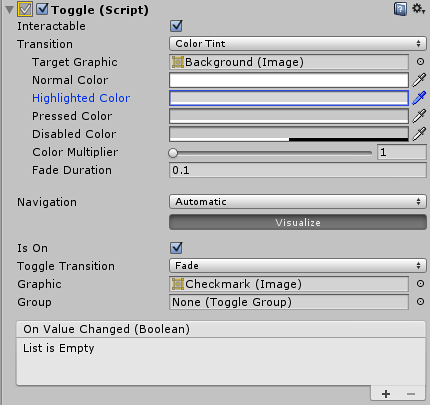
| Interactable | Will this component will accept input? See Interactable. |
| Transition | Properties that determine the way the control responds visually to user actions. See Transition Options. |
| Navigation | Properties that determine the sequence of controls. See Navigation Options. |
| Is On | Is the toggle switched on from the beginning? |
| Toggle Transition | The way the toggle reacts graphically when its value is changed. The options are None (ie, the checkmark simply appears or disappears) and Fade (ie, the checkmark fades in or out). |
| Graphic | The image used for the checkmark. |
| Group | The Toggle Group (if any) that this Toggle belongs to. |
Events
| Property: | Function: |
|---|---|
| On Value Changed | A UnityEvent that is invoked when the Toggle is clicked. The event can send the current state as a bool type dynamic argument. |
Details
The Toggle control allows the user to switch an option on or off. You can also combine several toggles into a Toggle Group in cases where only one of a set of options should be on at once.
开关切换控件允许用户切换选项,打开或关闭。你还可以组合几个开关成一个开关组在 哪个情况下应该立刻启用一组中唯一的选项。
The Toggle has a single event called On Value Changed that responds when the user changes the current value. The new value is passed to the event function as a boolean parameter. Typical use cases for Toggles include:
开关切换有一个单一的事件称为_On Value Changed,当用户更改的当前值时的响应。作 为一个布尔型参数,新的值传递给事件函数。使用切换的典型用例包括:
- Switching an option on or off (eg, playing music during a game).
- 切换选项,打开或关闭 (例如,在一场游戏中是否使用音乐)。
- Letting the user confirm they have read a legal disclaimer.
- 让用户确认他们已经阅读法律免责声明。
- Choosing one of a set of options (eg, a day of the week) when used in a Toggle Group.
- 当选择一个,一组选项 (例如,一周的一天) 切换组中
Note that the Toggle is a parent that provides a clickable area to children. If the Toggle has no children (or they are disabled) then it is not clickable.