Extending IMGUI
There are a number of ways to leverage and extend the IMGUI system to meet your needs. Controls can be mixed and created, and you have a lot of leverage in dictating how user input into the GUI is processed.
有很多种方法可以补充和扩展 UnityGUI 以满足您的需求。您可以混合和创建控件,并且可以有多种方法来规定用户 GUI 输入的处理方法。
Compound Controls
There might be situations in your GUI where two types of Controls always appear together. For example, maybe you are creating a Character Creation screen, with several Horizontal Sliders. All of those Sliders need a Label to identify them, so the player knows what they are adjusting. In this case, you could partner every call to GUI.Label() with a call to GUI.HorizontalSlider(), or you could create a Compound Control which includes both a Label and a Slider together.
GUI 中可能会出现各种情况,但总是同时出现两种类型的控件。例如,您可能会使用水平滑块创建“角色创建”(Character Creation) 屏幕。所有这些滑块都需要一个标签 (Label) 来识别,这样玩家才能知道它们是调节什么的。这种情况下,您可以将 GUI.Label() 的每个调用与 GUI.HorizontalSlider() 的调用配对,或者您可以创建一个同时包含标签和滑块的复合控件 (Compound Control) 。
/* Label and Slider Compound Control */


// JavaScript
var mySlider : float = 1.0;

function OnGUI () {
    mySlider = LabelSlider (Rect (10, 100, 100, 20), mySlider, 5.0, "Label text here");
}

function LabelSlider (screenRect : Rect, sliderValue : float, sliderMaxValue : float, labelText : String) : float {
    GUI.Label (screenRect, labelText);
    screenRect.x += screenRect.width; // <- Push the Slider to the end of the Label
    sliderValue = GUI.HorizontalSlider (screenRect, sliderValue, 0.0, sliderMaxValue);
    return sliderValue;
}


// C#
using UnityEngine;
using System.Collections;

public class GUITest : MonoBehaviour {

    private float mySlider = 1.0f;

    void OnGUI () {
        mySlider = LabelSlider (new Rect (10, 100, 100, 20), mySlider, 5.0f, "Label text here");
    }

    float LabelSlider (Rect screenRect, float sliderValue, float sliderMaxValue, string labelText) {
        GUI.Label (screenRect, labelText);

        // <- Push the Slider to the end of the Label
        screenRect.x += screenRect.width;

        sliderValue = GUI.HorizontalSlider (screenRect, sliderValue, 0.0f, sliderMaxValue);
        return sliderValue;
    }

}
In this example, calling LabelSlider() and passing the correct arguments will provide a Label paired with a Horizontal Slider. When writing Compound Controls, you have to remember to return the correct value at the end of the function to make it interactive.
在这个示例中,调用 LabelSlider() 并传递正确的参数将使标签 (Label) 与水平滑动条 (Horizontal Slider) 配对。编写复合控件 (Compound Controls) 时,请务必记住在函数结束时返回正确的值以使其交互
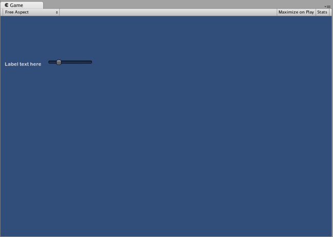
The above Compound Control always creates this pair of Controls
Static Compound Controls
By using Static functions, you can create an entire collection of your own Compound Controls that are self-contained. This way, you do not have to declare your function in the same script you want to use it.
使用静态 (Static) 函数,您可以为自己创建完备的复合控件集。这样您就不需要在同一脚本中使用函数时声明此函数。
/* This script is called CompoundControls */


// JavaScript
static function LabelSlider (screenRect : Rect, sliderValue : float, sliderMaxValue : float, labelText : String) : float {
    GUI.Label (screenRect, labelText);
    screenRect.x += screenRect.width; // <- Push the Slider to the end of the Label
    sliderValue = GUI.HorizontalSlider (screenRect, sliderValue, 0.0, sliderMaxValue);
    return sliderValue;
}


// C#
using UnityEngine;
using System.Collections;

public class CompoundControls : MonoBehaviour {

    public static float LabelSlider (Rect screenRect, float sliderValue, float sliderMaxValue, string labelText) {
        GUI.Label (screenRect, labelText);

        // <- Push the Slider to the end of the Label
        screenRect.x += screenRect.width;

        sliderValue = GUI.HorizontalSlider (screenRect, sliderValue, 0.0f, sliderMaxValue);
        return sliderValue;
    }

}
By saving the above example in a script called CompoundControls, you can call the LabelSlider() function from any other script by simply typing CompoundControls.LabelSlider() and providing your arguments.
通过将上述示例保存至 CompoundControls 脚本,您只需简单地键入 CompoundControls.LabelSlider() 并提供 变量,就可以从其他任何脚本中调用 LabelSlider()。
Elaborate Compound Controls
You can get very creative with Compound Controls. They can be arranged and grouped in any way you like. The following example creates a re-usable RGB Slider.
您可以利用复合控件 (Compound Controls) 变得更具创造力。它们可以按照您喜欢的方式排列和分组。以下示例将创建一个能够重复使用的 RGB 滑块。
/* RGB Slider Compound Control */


// JavaScript
var myColor : Color;

function OnGUI () {
    myColor = RGBSlider (Rect (10,10,200,10), myColor);
}

function RGBSlider (screenRect : Rect, rgb : Color) : Color {
    rgb.r = GUI.HorizontalSlider (screenRect, rgb.r, 0.0, 1.0);
    screenRect.y += 20; // <- Move the next control down a bit to avoid overlapping
    rgb.g = GUI.HorizontalSlider (screenRect, rgb.g, 0.0, 1.0);
    screenRect.y += 20; // <- Move the next control down a bit to avoid overlapping
    rgb.b = GUI.HorizontalSlider (screenRect, rgb.b, 0.0, 1.0);
    return rgb;
}


// C#
using UnityEngine;
using System.Collections;

public class GUITest : MonoBehaviour {

    public Color myColor;

    void OnGUI () {
        myColor = RGBSlider (new Rect (10,10,200,10), myColor);
    }

    Color RGBSlider (Rect screenRect, Color rgb) {
        rgb.r = GUI.HorizontalSlider (screenRect, rgb.r, 0.0f, 1.0f);

        // <- Move the next control down a bit to avoid overlapping
        screenRect.y += 20;
        rgb.g = GUI.HorizontalSlider (screenRect, rgb.g, 0.0f, 1.0f);

        // <- Move the next control down a bit to avoid overlapping
        screenRect.y += 20;

        rgb.b = GUI.HorizontalSlider (screenRect, rgb.b, 0.0f, 1.0f);
        return rgb;
    }
}
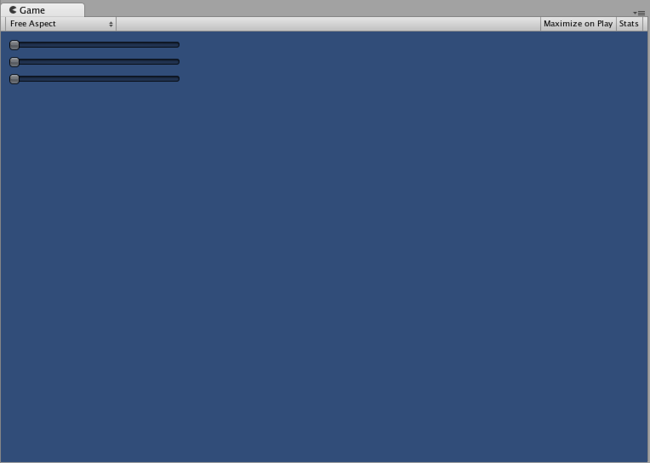
The RGB Slider created by the example above
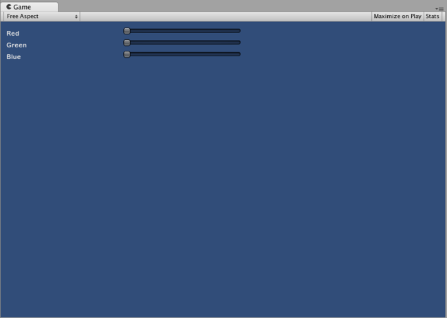
Now let’s build Compound Controls on top of each other, in order to demonstrate how Compound Controls can be used within other Compound Controls. To do this, we will create a new RGB Slider like the one above, but we will use the LabelSlider to do so. This way we’ll always have a Label telling us which slider corresponds to which color.
为了展示复合控件如何在其他复合控件中使用,现在让我们在它们各自上方创建复合控件。为此,我们将像上面那样创建一个新的 RGB 滑块,但是我们是使用“标签滑块”(LabelSlider) 来实现。这样就总有一个标签使我们可以分辨出哪个滑块对应哪种颜色。
/* RGB Label Slider Compound Control */


// JavaScript
var myColor : Color;

function OnGUI () {
    myColor = RGBLabelSlider (Rect (10,10,200,20), myColor);
}

function RGBLabelSlider (screenRect : Rect, rgb : Color) : Color {
    rgb.r = CompoundControls.LabelSlider (screenRect, rgb.r, 1.0, "Red");
    screenRect.y += 20; // <- Move the next control down a bit to avoid overlapping
    rgb.g = CompoundControls.LabelSlider (screenRect, rgb.g, 1.0, "Green");
    screenRect.y += 20; // <- Move the next control down a bit to avoid overlapping
    rgb.b = CompoundControls.LabelSlider (screenRect, rgb.b, 1.0, "Blue");
    return rgb;
}


// C#
using UnityEngine;
using System.Collections;

public class GUITest : MonoBehaviour {

    public Color myColor;

    void OnGUI () {
        myColor = RGBSlider (new Rect (10,10,200,30), myColor);
    }

    Color RGBSlider (Rect screenRect, Color rgb) {
        rgb.r = CompoundControls.LabelSlider (screenRect, rgb.r, 1.0f, "Red");

        // <- Move the next control down a bit to avoid overlapping
        screenRect.y += 20;
        rgb.g = CompoundControls.LabelSlider (screenRect, rgb.g, 1.0f, "Green");

        // <- Move the next control down a bit to avoid overlapping
        screenRect.y += 20;

        rgb.b = CompoundControls.LabelSlider (screenRect, rgb.b, 1.0f, "Blue");

        return rgb;
    }

}